Create a Digital Destination for Your Consumers
BY: JENNI HILL | APRIL 27, 2022 – 6 MIN READ
Key Takeaways (6-minute read)
- Spending time and money on excellent UX and UI is worth it.
- Create a destination where your consumers can get exclusive brand content and make it desirable through an insiders’ mentality.
- Audiences want to be entertained, so don’t let them down.
- 49% of consumers expect to shop online more frequently, even after the pandemic and 29% want the experience to be entertaining – GWI’s 2021 Consumer Research report.
- Great websites hit the “must-haves” for success but then pull out all the stops to engage audiences.
In a time when we can hardly imagine a brand not having a website at all, it’s not enough to simply have one with the basic information. For leaders who want their brands to stand out and generate revenue, grow customer loyalty, and expand, a website needs to become a destination. Give your target audience a reason to keep coming back to your digital space because they want to. You can achieve this through a combo of the must-haves and the “extra” special touches that will really make a brand stand out in an endless sea of others.
Great UI and UX: User Interface and Experience
Never underestimate the importance of good looks (UI) and a great user experience (UX). Creative strategy isn’t just for print or marketing materials; your website should reflect your brand’s commitment to the customer through a pleasing design—both for the eye and the mind.
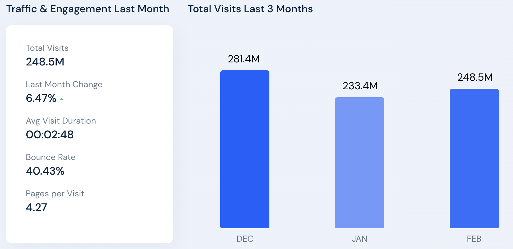
Sure, there are thousands of websites out there that can give advice on health. But what’s making Healthline.com the number one website in its category, with over 248 million visitors per month and a bounce rate of just 40%? Part of it can certainly be attributed to the health-focused media site’s colorful, visually appealing design.
This website looks so good from a creative standpoint and performs so well thanks to:

Traffic & Engagement of the Healthline Website
- Large “hero” imagery at the top of the site upon opening creates an immediate interest in the latest content or topics the brand wants to promote
- Use of digital illustrations to create a cohesive branded look for various topics and sections throughout the site
- Scroll-through navigation on the home page provides easy-to-digest sections for content: i.e. Health Topics, Latest News, Email Signup, Featured Video, Product Reviews, etc.
- Seamless transition between desktop and mobile design and UX (especially important as around 54% of web traffic comes from mobile users)
- Clear keywords throughout headers and article titles—leveraging great SEO for organic search referrals
According to the New York Times, Red Ventures, the juggernaut digital media group behind Healthline.com, “found itself in the publishing business almost by accident and is now leading a shift in that industry toward what is sometimes called ‘intent-based media’—a term for specialist sites that attract people who are already looking to spend money in a particular area (travel, tech, health) and guide them to their purchases, while taking a cut.” Through this referral-type marketing strategy, Healthline.com sees an annual revenue between $100–$200 million.
“These low-profile media companies are riding a shift in technology as both Apple and regulators have eroded the dominance of the creepy advertising technology that allows companies to track you across websites,” the Times goes on. “That has helped push the pendulum back toward the old-fashioned idea of connecting with readers seeking information relevant to their lives, whether it’s a Field & Stream article on the latest fly rods or a Healthline guide to Crohn’s disease treatments.”
Exclusivity
Give your consumers a reason to visit your site. They need to be going there because they can’t get this content, experience, or service anywhere else. Making your online presence into a destination rather than merely a tool or a billboard is crucial for maintaining and growing your consumer base.
People can buy Gucci’s clothing in a number of department stores, but visiting the luxury fashion brand’s website is a unique experience that does more than just provide an ecommerce portal.
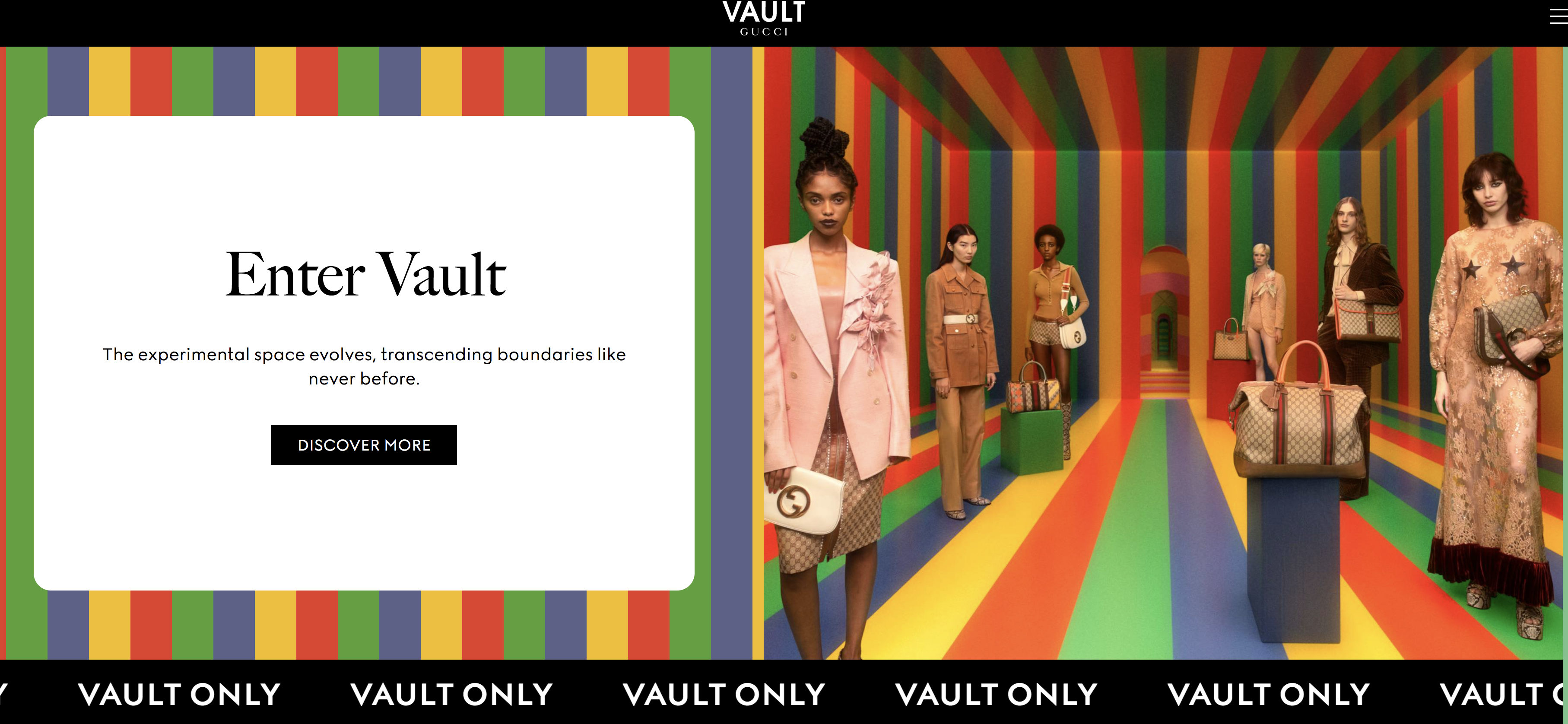
Labeled as one of the most exclusive and desirable brands in the world, Gucci has tapped into the creative marketing strategy not only through its irreverent and memorable runway shows and ad campaigns but also its digital offerings. Gucci.com is first and foremost for shopping, yes, but fans of the brand can also consume exclusive content there. Photo essays, stories, behind-the-scenes looks, exclusive collection drops through the Gucci Vault membership portal, and—coming soon, it says—a Metaverse experience that members can currently get information on through the brand’s private server on Discord. All this is content you can’t get anywhere else.
Gucci consistently ranks in the top 10 most successful luxury fashion brands online, and that can also be attributed to creative director Allesandro Michele’s understanding of his target market—millennials. The majority of the brand’s audience has shown to be under 40. It’s a great case study for going where your audience is: our own Millennial Report shows that this audience is primarily using Instagram and YouTube for its social media and consuming online content. YouTube and Facebook/Instagram made up over 50% of Gucci.com’s social media traffic referrals in February of 2022. When Gucci began leveraging more social media strategy, influencer marketing, and video content online in the mid-2010s, it saw a tremendous spike in web traffic as a result. According to SimilarWeb, Gucci saw its total site traffic increase 46 percent in 2017 compared to the year prior, and its revenue continued to climb exponentially until 2020. Even with the pandemic setback, the brand has bounced back relatively quickly.
Pair all of this strategy with an interesting, visually appealing website design and photography, and you’ve got a recipe for an online destination that loyal followers will return to time and again.
Entertainment Factor
There’s a reason YouTube is still one of the top most-visited and most profitable websites, period, or why many early internet users still remember those “oldies but goodies” from sites like eBaum’s World or Homestar Runner. Who didn’t see the infamous Dancing Baby back in 1996 that was perhaps the first viral online content ever? A mixture of silly-yet-entertaining videos, characters, and games flooded the internet then, and it still does with TikTok and other user-generated content platforms today. The difference is the saturation level is so high, it’s almost impossible to get your content out to the widest audience without paid advertising. But the fact remains: people want to laugh, cry, or generally feel something when they’re consuming digital content.
“Ecommerce boomed as stay-at-home orders were issued, and the increased activity will stick. 49% of consumers expect to shop online more frequently, even after the pandemic,” says global researcher GWI’s 2021 Consumer Research Report. “But given the context of a virus, aspects of the experience could become stale. Product delivery has to be socially distanced, there is little interaction with staff or fellow shoppers, and, most of all, fewer ways to distinguish a brand.” The report goes on to say, ”29% want the experience to be entertaining.”
So, although an impeccably designed digital throwback to The Goonies might not be the website you’re building, it’s still a good idea to bring some entertainment factor to your site so consumers will want to come back often. This might be in the form of blogs or stories that generate new interest. Or, in the case of our clients at The Franklin Institute in Philadelphia, it could mean creating a video series that drives your audience to subscribe and revisit weekly for new episodes. When the renowned science museum was looking to boost its UX in a post-COVID world so it could offer its members more even if they couldn’t visit the brick-and-mortar museum often, our team and our parent brand studio, Antonio & Paris, jumped in to create Beyond, an online entertainment platform built into The Franklin Institute’s existing digital space.
When Beyond launched in January of 2022, The Franklin Institute’s website saw a jump in its overall global website ranking of over 42,600 slots and an increase of over 27,000 users over December 2021.
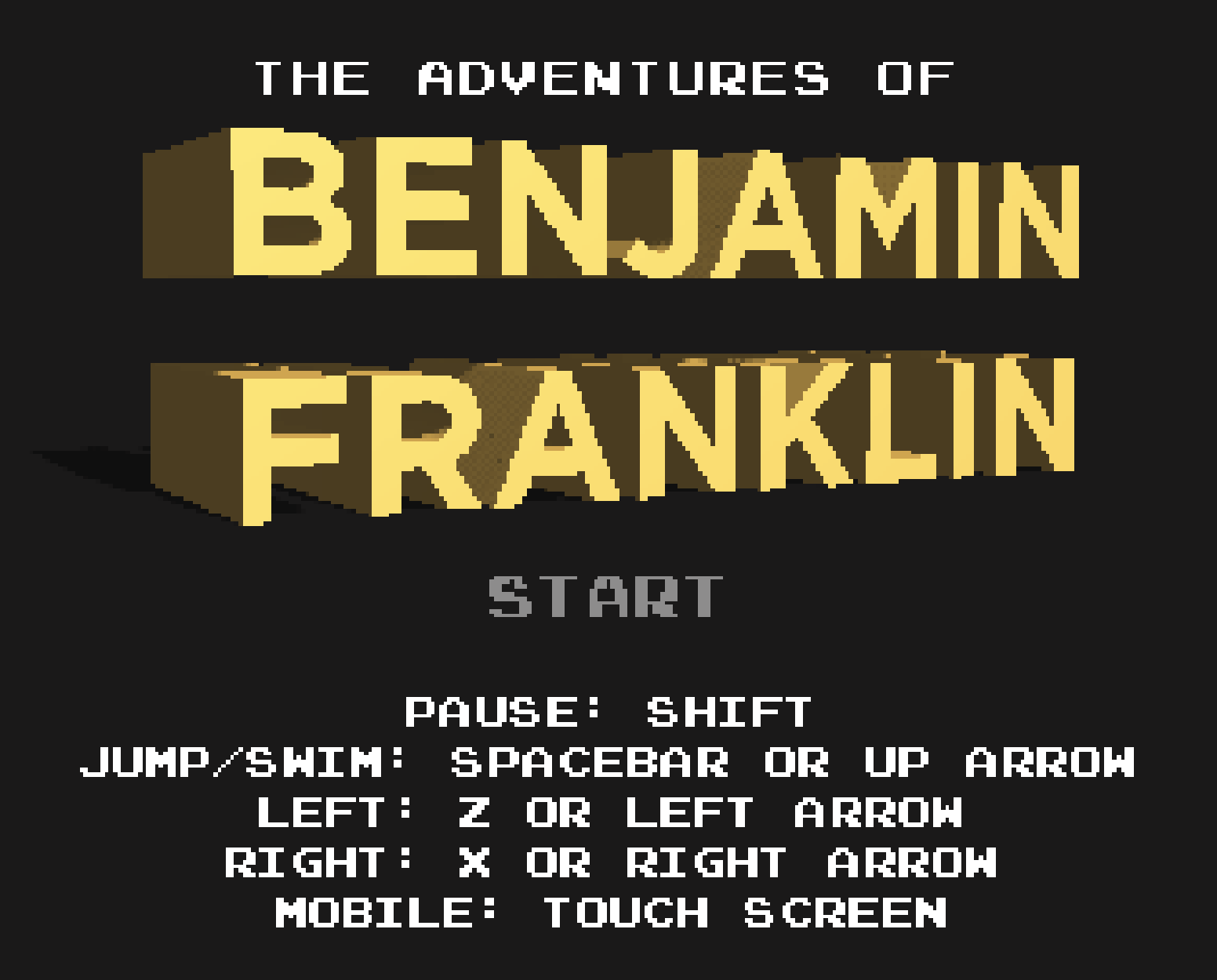
 The institute has always had a knack for entertaining. Just check out this gem, The Adventures of Benjamin Franklin, an 8-bit Super Mario–style video game developed by The Franklin Institute to promote the museum’s special exhibition Game Masters and allows users to play as Ben Franklin as he “races to collect lightning, climb Independence Hall, and more.” While entertaining and educating its website visitors with a healthy dose of nostalgic fun, the game also garnered the museum press from PBS, NPR, and more.
As the internet evolves and new platforms and experiences such as the Metaverse arise, it’s important to keep up with the trends and must-haves in digital best practices. It’s even more important to be aware of what consumers want and to provide them an online destination to fulfill those desires. Digital might seem impersonal because you’re interacting through a screen, but it’s the top platform for connecting and broadening your audience in today’s world. Let our creatives, marketing strategists, and brand futurists help fulfill your company’s goals through a dynamic, consumer-driven digital experience. We’re just a click away.

WRITTEN BY
Jenni Hill
Short Bio — Graphic design, web development, and imagination expert Jenni Hill joined the Antonio & Paris team in 2019. A front-end developer for over a decade, Jenni has developed and managed numerous websites of various types. Her career background is as colorful as her creative mind, as she has worked in industries ranging from fireworks to high-end jewelry and everything in between. As the Associate Creative Director at A&P and its digital wing, Digital Caliente, she has worked with The Franklin Institute, Oncocyte, CertaPro, ThermoFisher, Teo Bok, Juno, and others to establish logos, branding, video and animations, promotional creative (print and digital), web design, and more. Jenni’s adventurous spirit and love for new experiences make her favorite projects those that allow the imagination to run wild. She loves working with clients who are open to innovation through the unexpected (aka, the weird stuff). If you want boring and unoriginal, you’ve come to the wrong creator!


